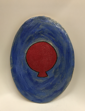
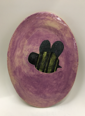
These are plates that have a red balloon and a poorly made bee on them... The top plate is blue and the bottom plate is violet. The element of design I used the most in these pieces is shape because there are shapes in the figures that are drawn and they are 2d. The principle of design I used the most in these platters is emphasis because the drawings are the first thing you see when you look at them. The artist that I used as inspiration for these plates is Milne and illustrator E.H. Shepard. The purpose of these plates was to serve food on them. I liked these platters before they were fired in the kiln but now they are warped (which I take responsibility for). But now I just don't like them as much as I would if I made sure the plates dried at the same time.
